

(So this is my go at GIF-ing round #2. I put it up on the Open Access Antiquarianism page too, but thought I’d double post it here. More soon. x)
Scientific diagnostics can tell us a lot about the world around us. But they’re far more powerful and appealing when they’re visualized appropriately.
For every exciting x-ray, infrared, or ultraviolet image that tells art historians and architects about what lies beneath the image or wall visible to the naked eye—before and after images were the only way to go.
Until now.
GIFS are wonderful little creatures quickly being adapted into internet platforms. And art historians, architects, archaeologists, and especially museums need to start using them more often and more effectively to show off their array of multi-spectral imaging on cool artifacts, art, and structures. Everyone should be getting on the visualization-wagon and starting to find new ways to engage with an increasingly fickle attention-challenged audience who actually really does want to know this kind of stuff and see it—if only there were palatable ways to do so (and pipelines to funnel scientific data into aesthetically pleasing visuals like the one’s I’ve made from the data below.
I’ve been playing around with GIFs for my articles at Allday.com, and leaped at the chance to apply the new art-form to our cultural heritage and open access work (and yes, it is arguably an art form, and an awesome one at that). My very first archaeo-attempts at GIF-ing my data are up on Adventures in Digital Archaeology. And there’s more on the way.
Here are the results of a bit of faffing around online correlating scientific data and images into appropriate GIFs—focusing on the wonderful realm of diagnostic imaging in art Vid, Mike, and I have worked in under the tutelage of the amazing Maurizio Seracini. I focused my open access data hunt on paintings that were subjected to pentirsi, or ‘repenting’ and changed by their artists or had the canvas re-used entirely. Without multi-spectral imaging and cultural heritage diagnostics, we’d have no idea that there were these secret lives to these famous works, lurking just below the surface of the visible spectrum.
There’s a sampling summary article on Allday. More soon. So stay tuned.
 This A Bar at the Folies-Bergère, by Edouard Manet juxtaposed with an x-ray of itself–which shows off the change in hairstyle Manet made to his maid. Musée des Beaux Arts, Tournai.

Raphael’s portrait of Pope Julius II paired with its x-ray makes it easier to see the change in wallpaper design that adds an unsettling ghostly affect all around the sacred pontificate. National Gallery, London.

As Maurizio so fabulously discovered, Raphael’s Lady with the Unicorn actually stars a converted lap-dog. Galleria Borghese, Rome.
 Leonardo Da Vinci’s Mona Lisa reveals quite a bit of change to the facial positioning when its x-ray and emissiograph are flashed over it. Louvre, Paris.
 The Small Cowper Madonna by Raphael had an xray, infrared, and ultraviolet online, making for one hell of a comparison. One that literally ends in ‘bitch-face.’ National Gallery of Art, Washington DC. Scientific data collection was undertaken by a group backed by the Andrew W. Mellon Foundation. You’ll note that this is the first time I’ve been able to say who actually conducted the diagnostic imaging research you’re looking at. That’s because the metadata and paradata aren’t as easy to track down once the images are out there. Its something the cultural heritage community really needs to sort out. Especially as many of the diagnostic technologies and conservation efforts are still at an interpretative stage—it would definitely be good to know who was doing the interpretation (movies get credits, why not art, architecture, and archaeology data?)

This Hendrick van Anthonissen Scheveningen Beach Scene was being cleaned by conservator Shan Kuang of the Hamilton Kerr Institute when she noticed some strange things starting to emerge beneath the outer layers of smutty varnish. A whole whale had been hidden away. Fitzwilliam Museum, Cambridge,

When subjected to macro-X-ray fluorescence, Phillip Otto Runge’s Pauline in a White Dress revealed that it once had an entirely different star: a more vivacious blonde with purple hair ribbons (who was most definitely not Runge’s wife Pauline who appears in the visible painting). The different elemental signatures picked up from the paint signal the colors beneath the current painting. The research was conducted by Matthias Alfeld of the University of Antwerp, Belgium and Shannon Hughes of University of Colorado Boulder, and others. The data set the team was working on was from the Van Gogh Museum, Amsterdam, so I presume this painting was from there as well—though again, the basic information on these things ends up being oddly opaque.

Vincent Van Gogh’s Still Life with Meadow Flowers and Roses utilized a previously painted canvas of two young wrestlers. It was a piece of homework from Vincent’s time at art school. Kröller-Müller Museum, Otterlo, Netherlands. (PS. I’m not sure of the alignment on this one. Concerningly there were actually a lot of images/x-rays with no placement images to hint at what bit of the painting they are under. This is the only one I went forward on GIF-ing with wonky alignment. But this too is a data issue that ought to be addressed (and is in Vid’s system visual alignment system they used for the Nat Geo Battle of Anghiari project).

Pablo Picasso’s The Old Guitarist also utilized a previously painted canvas. A girl and an ox are visible in the x-ray (and even more so in the shadow saturated version of the x-ray). The Art Institute, Chicago.

Titian’s Venus with a Mirror was reused as well. Titian flipped the canvas on its side and then tried again, turning the original double portrait into a solitary image of Venus, re-using part of the the earlier arm-work in the process. National Gallery of Art, Washington, D.C. Research for this one was also done under the Andrew W. Mellon Foundation.
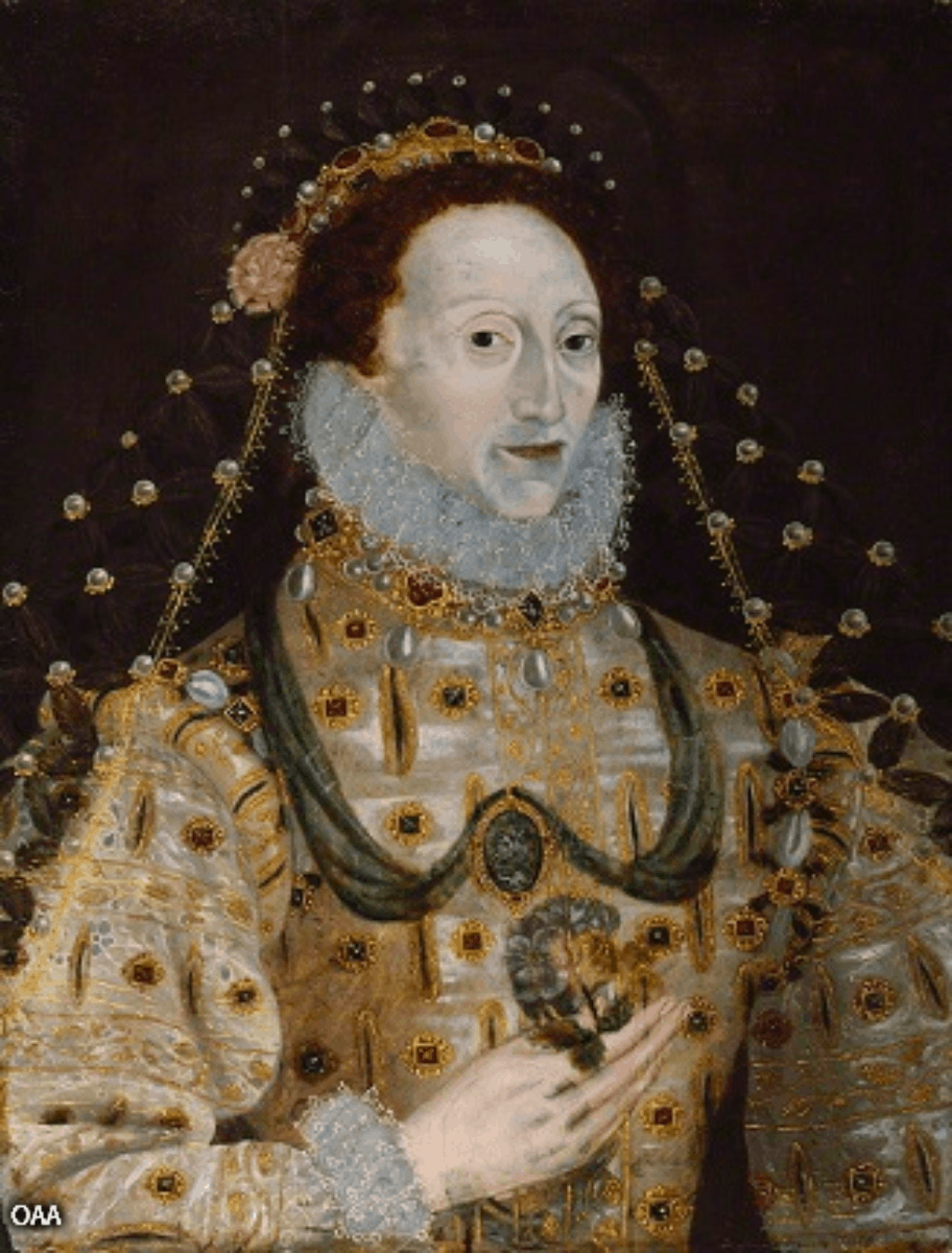
This portrait of Queen Elizabeth I by an unknown artist had a ghostly (and far prettier) original subject revealed by its x-ray. National Portrait Gallery, London/Kenilworth Castle, Warwickshire. Please note that despite their copious amounts of metadata on the National Portrait website, its terribly difficult to track down what diagnosticians were working on the project. And that their “Compare Images” section still relies on before and after clicking.
 The Blue Room by Pablo Picasso has an invisible man lurking underneath it. He’s sideways, but he’s there. And the odd brushstrokes in that section of the painting had people at the Phillips Collection questioning it long before the technology existed to actually spy it out. This part of the collection is usually in Washington D.C. but seems to be touring South Korea at last noted notice.

This last one is a bit more delightfully complicated (and controversial). It’s believed to be a portrait of Isabella de’ Medici. Initially it was believed to have been of her mother, Eleanora of Toledo painted by favored court painter Bronzini—but the clothing matches up to Isabella more accurately.
When the Carnegie Museum of Art in Pittsburgh first acquired it, they were concerned it might be a fake. But investigation by their diagnosticians and historians like Lulu Lippincott revealed that it wasn’t a fake, it was a cover up. 19th century restorer Francis Leedham had taken lots of liberties with it and doctored it for his Victorian audience. He made the woman much younger, and erased her halo so that she’d be more in lines with 19th century ideals of demure feminine beauty—which also preferred smaller hands. So he made Isabella’s massive mits more dainty too, erasing the urn in her hands in the process.
Given that the Carnegie Museum now had a much more interesting painting hidden under the Victorian gloss, they decided to go whole-hog and excavate it. Conservator Ellen Baxter not only stripped the Victorian image off the Renaissance painting, she also artfully reconstructed the damaged areas of the original painting—begging the question of where the line is between science and art. And even more debatable—what right do we have to return the piece of art to its natural state? Are the piece’s temporal attributes (even if they’re not what the artist intended) not now a piece of the living art? And how do you guarantee that the conservators don’t add in a bit too much of their own flair into the restored work? The ethics on such situations are boggy.
PS. The GIF at the very very top of the post (whose caption is here instead of there because WordPress has issues making captions look decent) is: Aelbert Jacobsz Cuyp’s Lady and Gentleman on Horseback. National Gallery, Washington D.C. Note the change of costume on the gentleman—the original version has him kitted out in military gear and a rather fabulous hat.
__________________________________________________________________________
I made all of these from just the snippets of information available online—mostly from news articles that happened to include a pic of the x-ray (only the Andrew Mellon Foundation had theirs archived nicely). An alarming amount of x-ray painting stories don’t even show the x-ray—they show the painting and then describe the x-ray results (=lame). And this is only a small fraction of what’s out there in terms of multi-spectral imaging already done on the world’s most famous art.
I know that the museums of the world and the diagnosticians have more that hasn’t made it out to the public yet. Maurizio Seracini has a massive collection in his offices in Florence he’d like digitized but there’s never any time or more importantly money to pay for our time for us to digitize them for him (one of my many dream projects). So not only do we need to be pushing for cooler visualization at the public end of the spectrum with GIFs, we need to encourage pipelines that gets this data out where it can be used and turned into lovely visuals.
In conclusion: GIFs. They’re awesome. And approachable vis that experts and audiences can appreciate. The cultural heritage community needs to start using the visualization available to them and pushing the boundaries to build better systems.

One thought on “Multi-Spectral GIF Playtime”